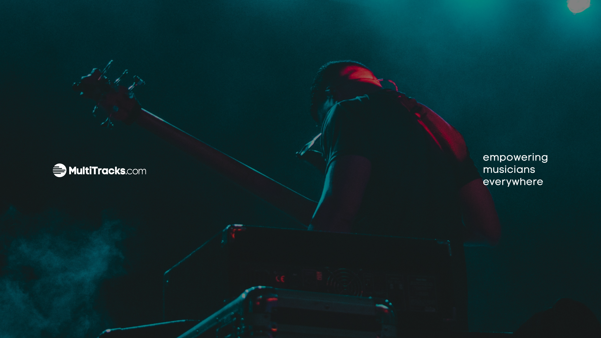
MultiTracks.com – Brand Refresh & Pricing Model Redesign
Featuring: MultiTracks One / The Live Bundle / The Rehearse Bundle
Role: Creative Team Lead - Art Direction, Branding
The Challenge
MultiTracks.com had grown into a robust ecosystem of products and tools, but with that growth came complexity—particularly in our pricing structure. Users consistently shared that the purchasing experience was confusing and unclear, ultimately creating friction where simplicity was needed most.
The Truth
Our customers weren’t wrong. As a company that prides itself on Customer-Driven Innovation, we recognized that the way people engaged with our platform had evolved—yet our pricing hadn’t kept pace. To stay aligned with our mission and serve our users better, we needed to do more than just tweak prices—we needed to completely rethink our model.
The Work
We didn’t just restructure our pricing; we rebranded the way our customers experience MultiTracks.com.
Central to this effort was a complete visual identity system for the new bundles, designed to intuitively communicate their purpose and energy:
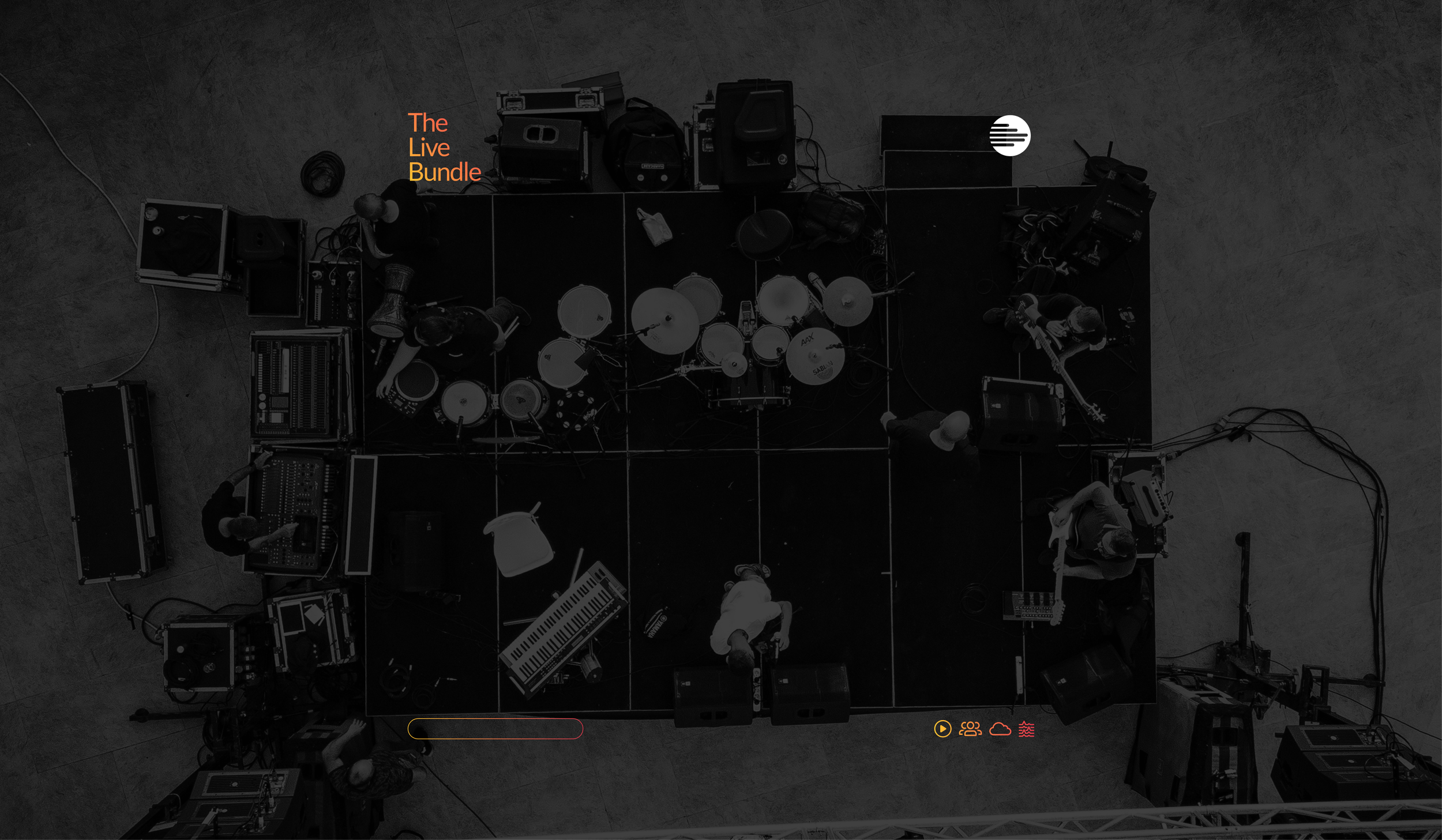
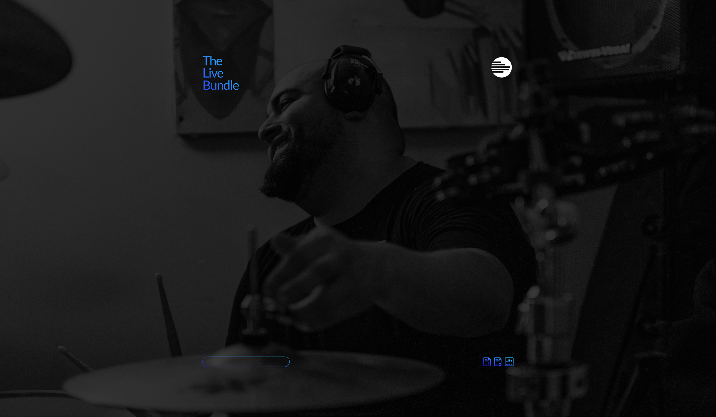
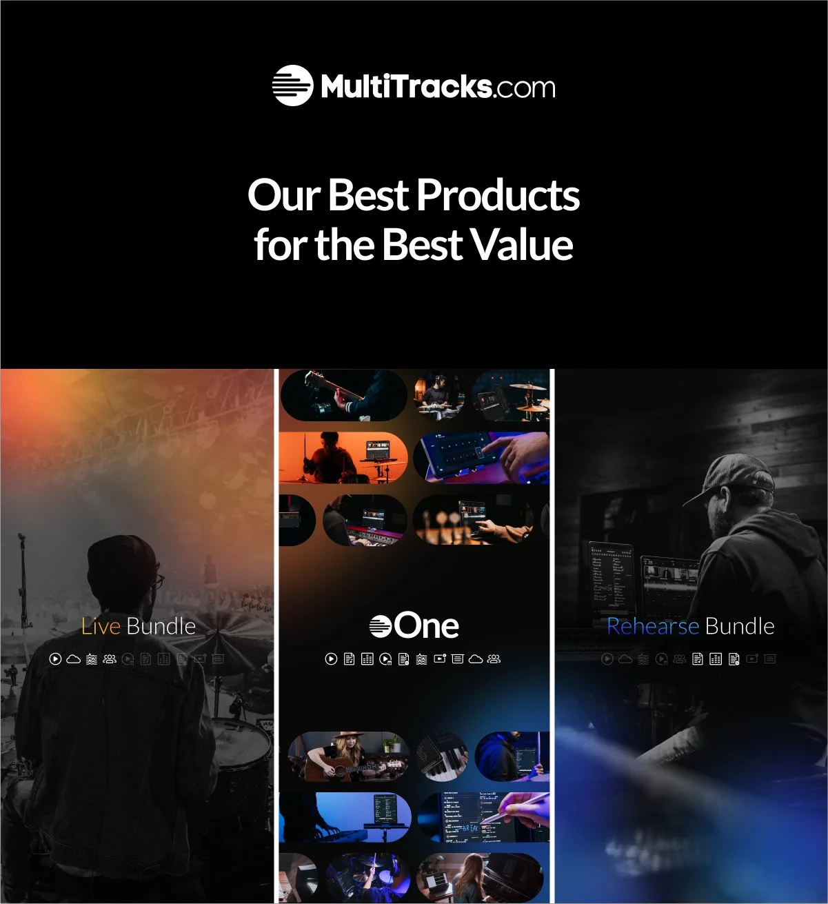
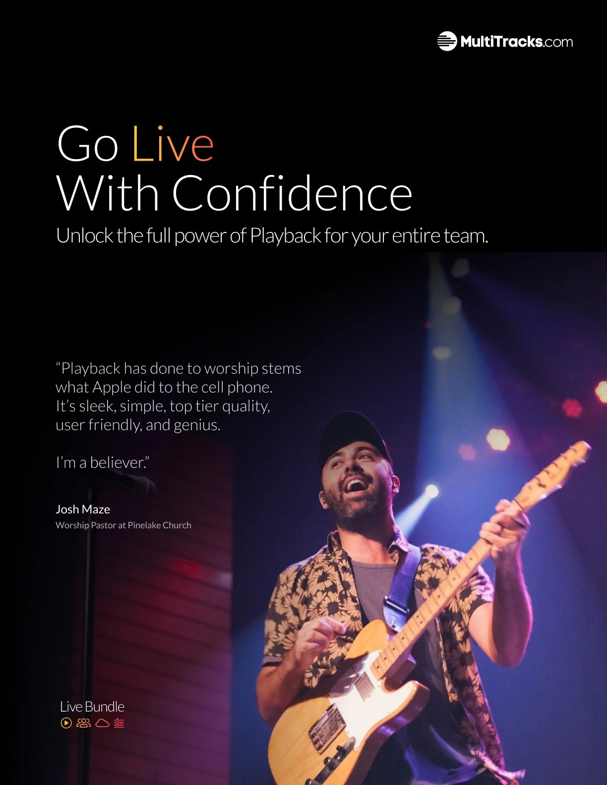
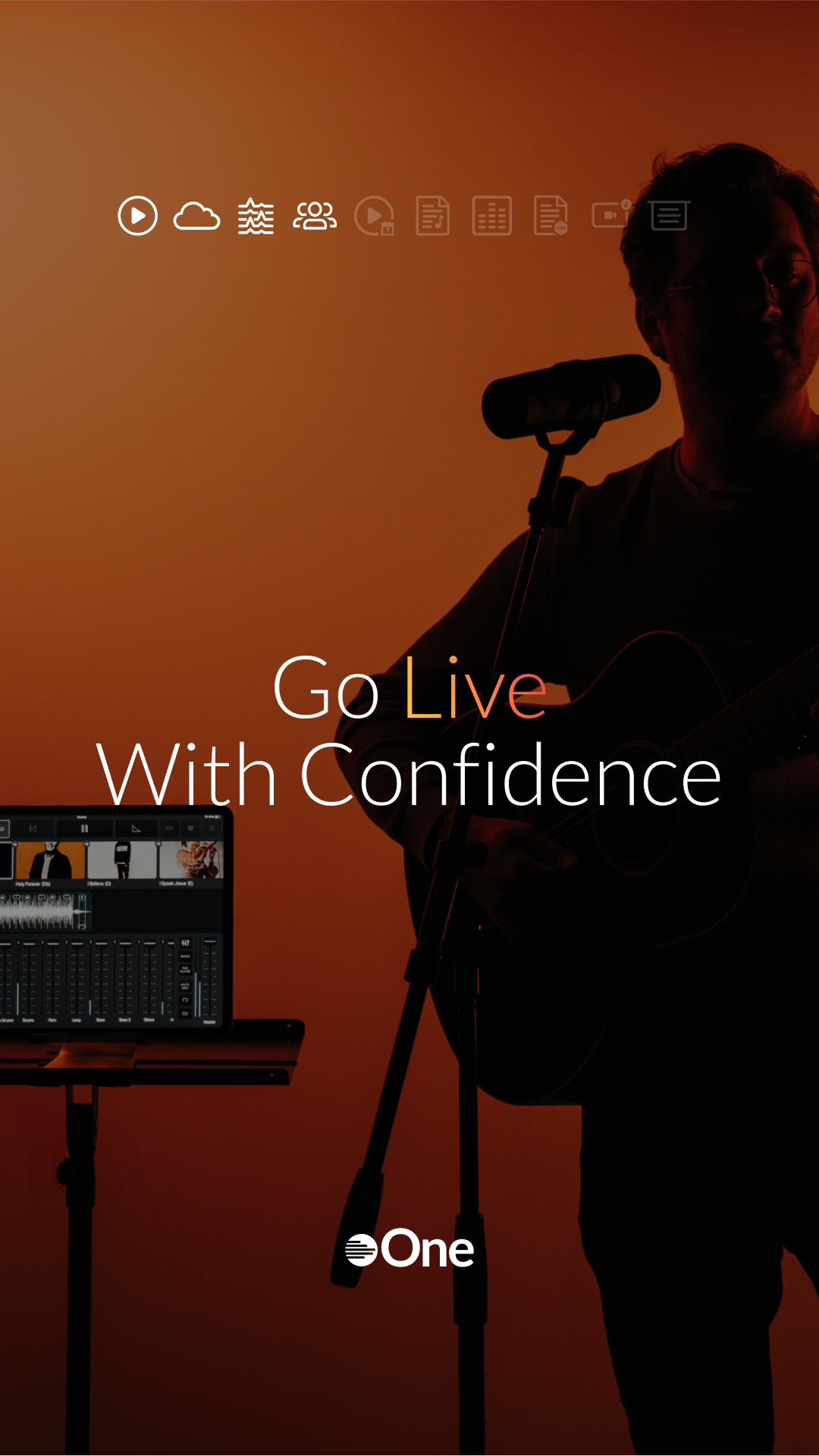
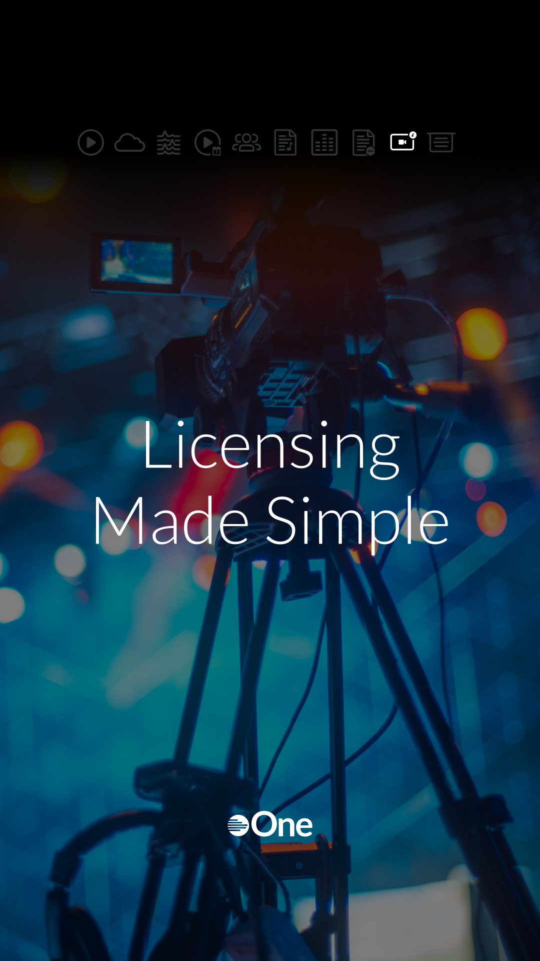
The Live Bundle was built for live performance; the moment where everything comes together. To reflect its high-energy, raw intensity, we branded this bundle with a red, orange, and yellow gradient. It’s bold, urgent, and unmistakably live. Supporting icons visually unified the suite of products used during performance, from setlists to playback.
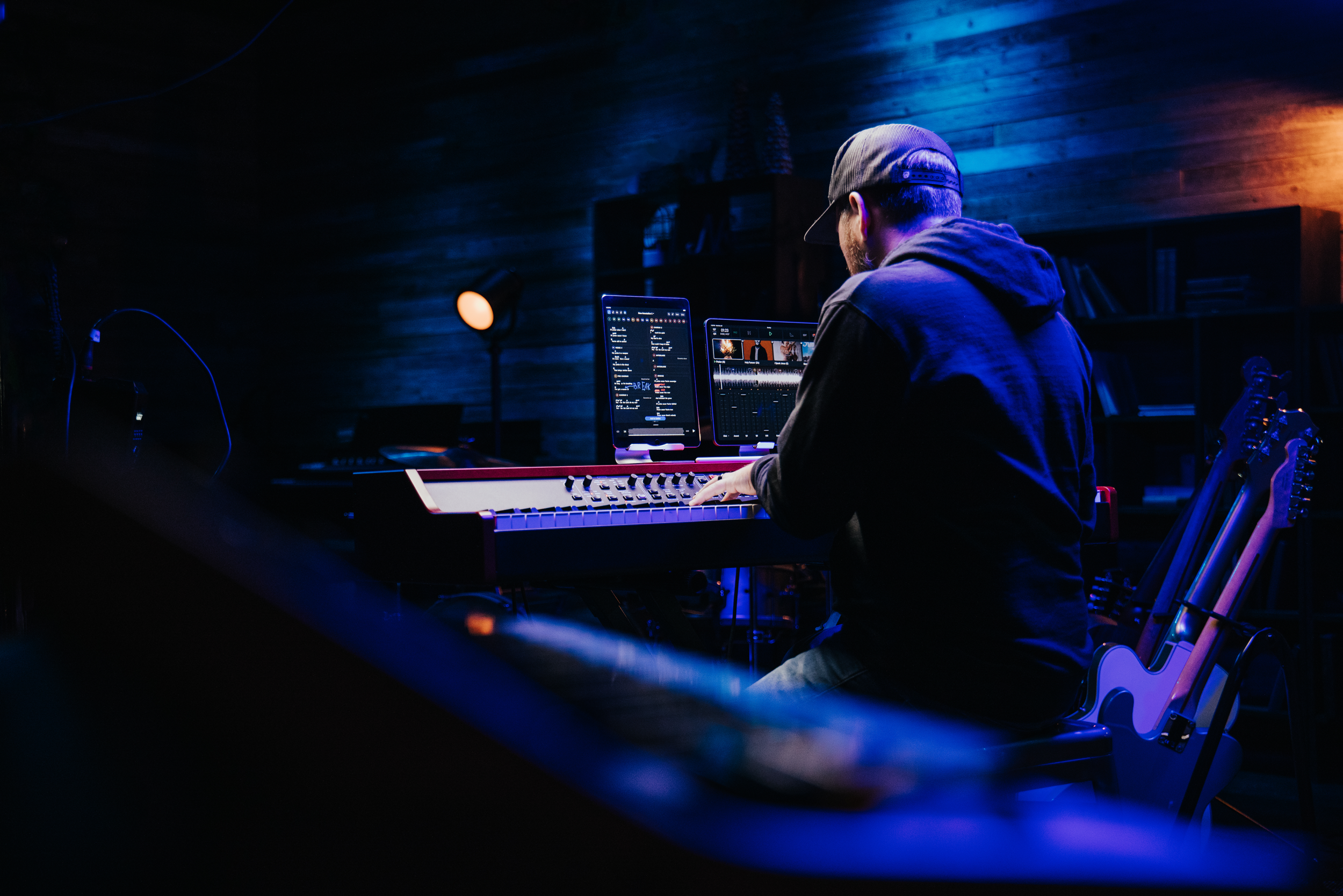
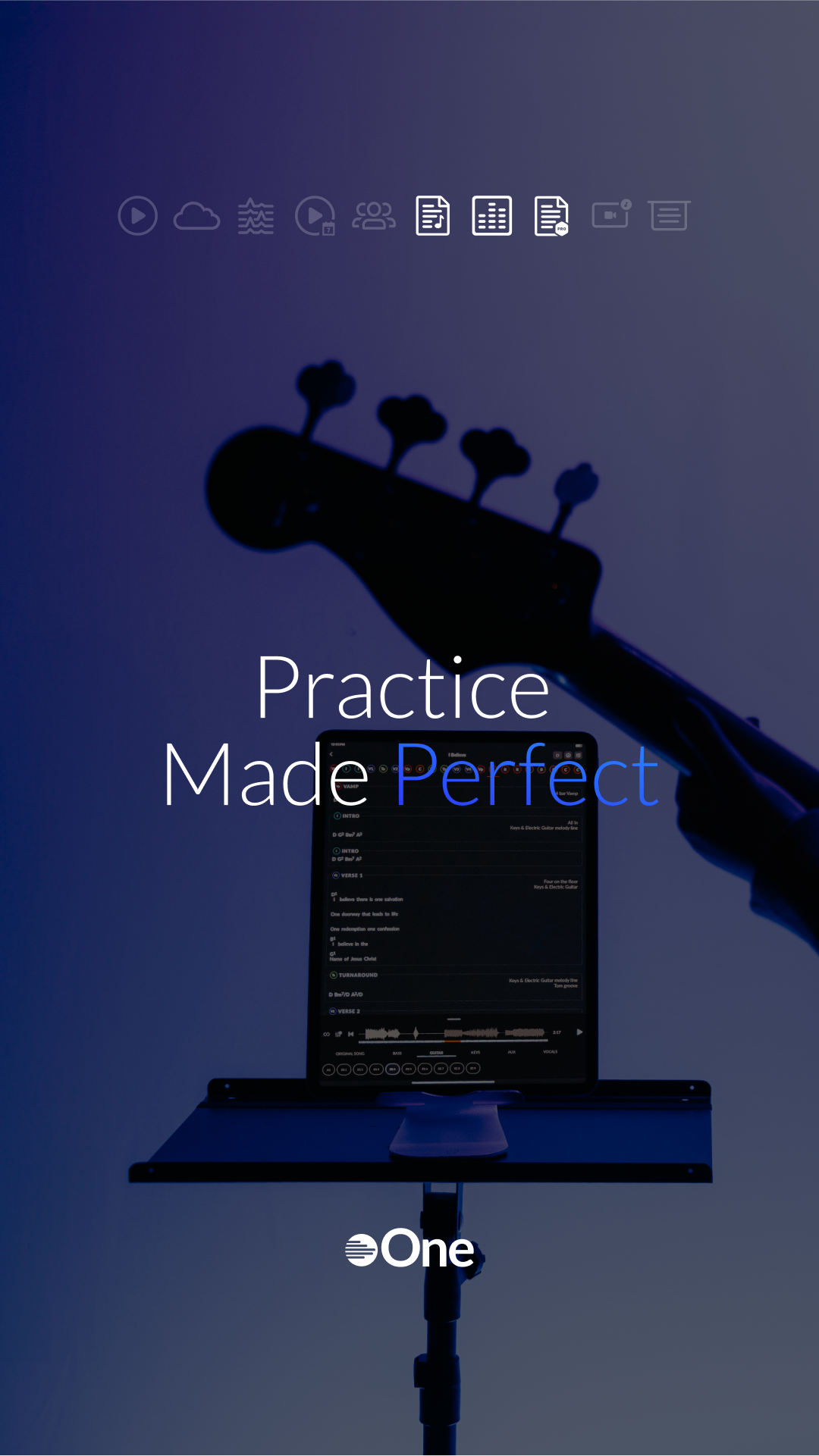
The Rehearse Bundle was all about preparation, study, and practice. For this, we created a calm, focused visual environment using a cool gradient of blue, light blue, and indigo. The icons in this set represent tools used behind the scenes—when the lights are off and the work is happening.
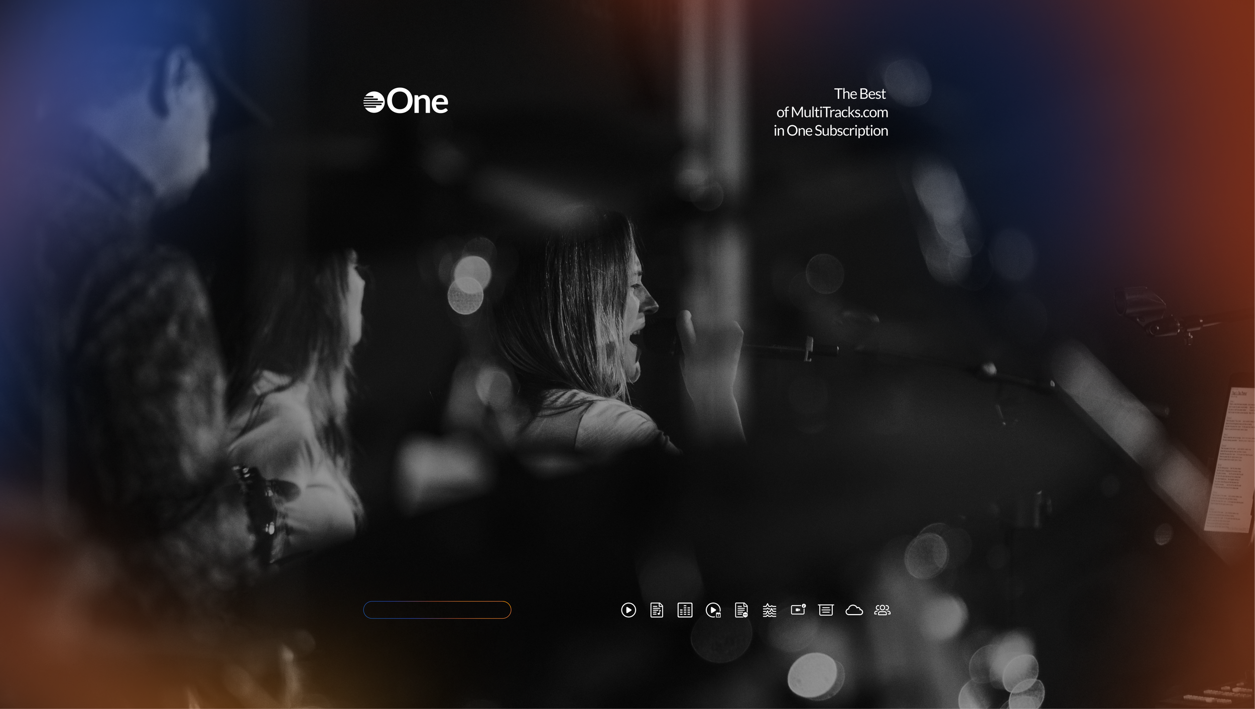
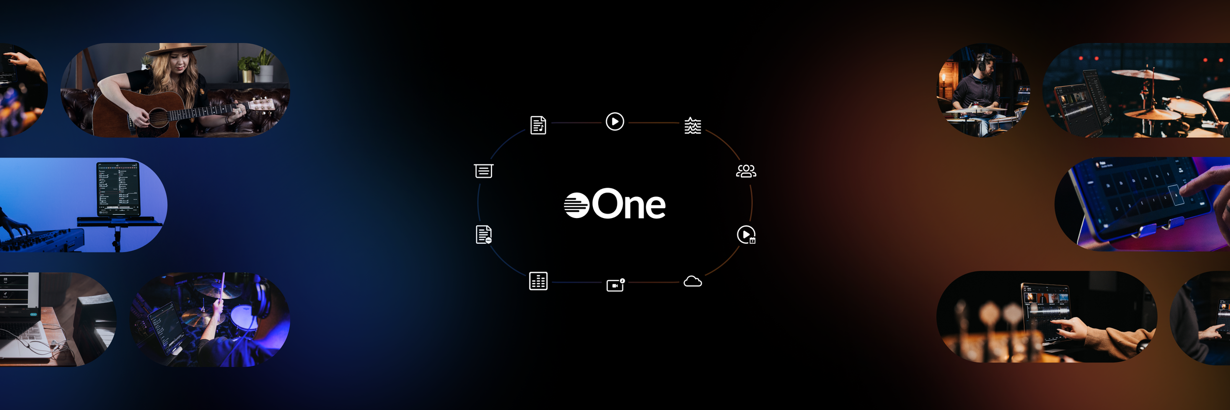
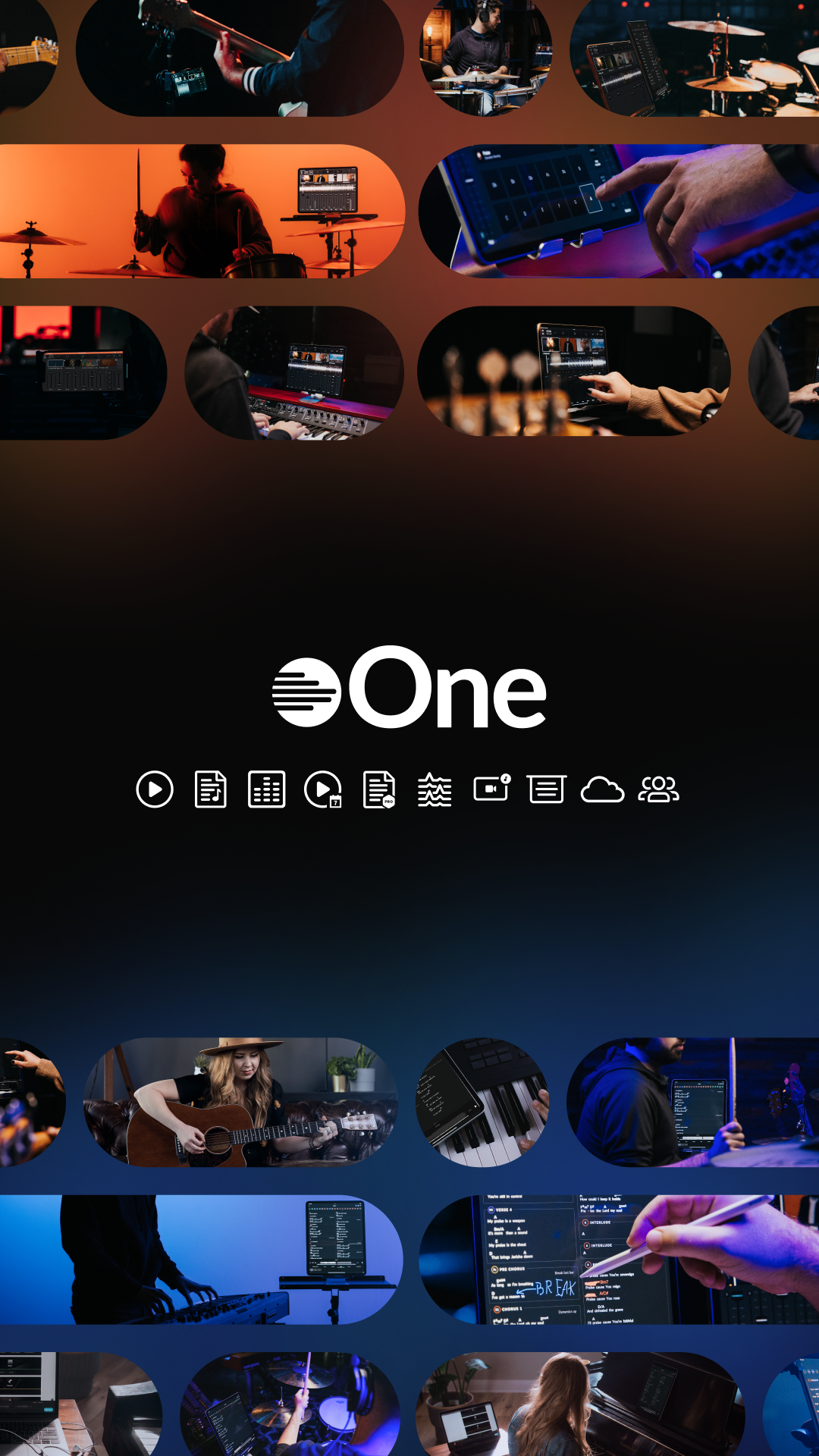
MultiTracks One was the ecosystem’s crown jewel; the umbrella under which all tools and workflows converge. We crafted a minimalist black-and-white aesthetic infused with subtle touches of both the Live and Rehearse gradients, symbolizing the convergence of preparation and performance. Iconography here connected every product in the platform, representing holistic integration.
This brand system was not just aesthetic—it became a functional language that helped users navigate our offerings intuitively. Each bundle felt distinct yet connected, communicating not just what the products were, but when and how to use them.
The Results
This wasn’t just a pricing update—it was a company-wide shift. The launch not only simplified how our customers interact with MultiTracks.com, but also repositioned us to grow sustainably with them. Early engagement data showed a strong uptick in bundle sign-ups and reduced user confusion, validating both the strategic and creative direction.
Credits:
Creative Direction & Art Direction – James Windham
Videography – Mitch Obach
Photography – Joshua Taliaferro
Email Marketing – Wayne Yaun
Leadership – Kristian Ponsford & Jose Huerg

Ads

Web Work
Social media Work

Premier Inc. — PINC AI Brand Experience
Charlotte, NC · 2021 · Art Direction, Brand Experience, Environmental Design
Premier Inc. (NASDAQ: PINC) is a healthcare technology company connecting more than 4,350 hospitals and roughly 300,000 providers across the U.S. I spent four years there, two as a senior designer and two as Manager of Design and Art Direction, leading brand experience for live and virtual events.
The Challenge
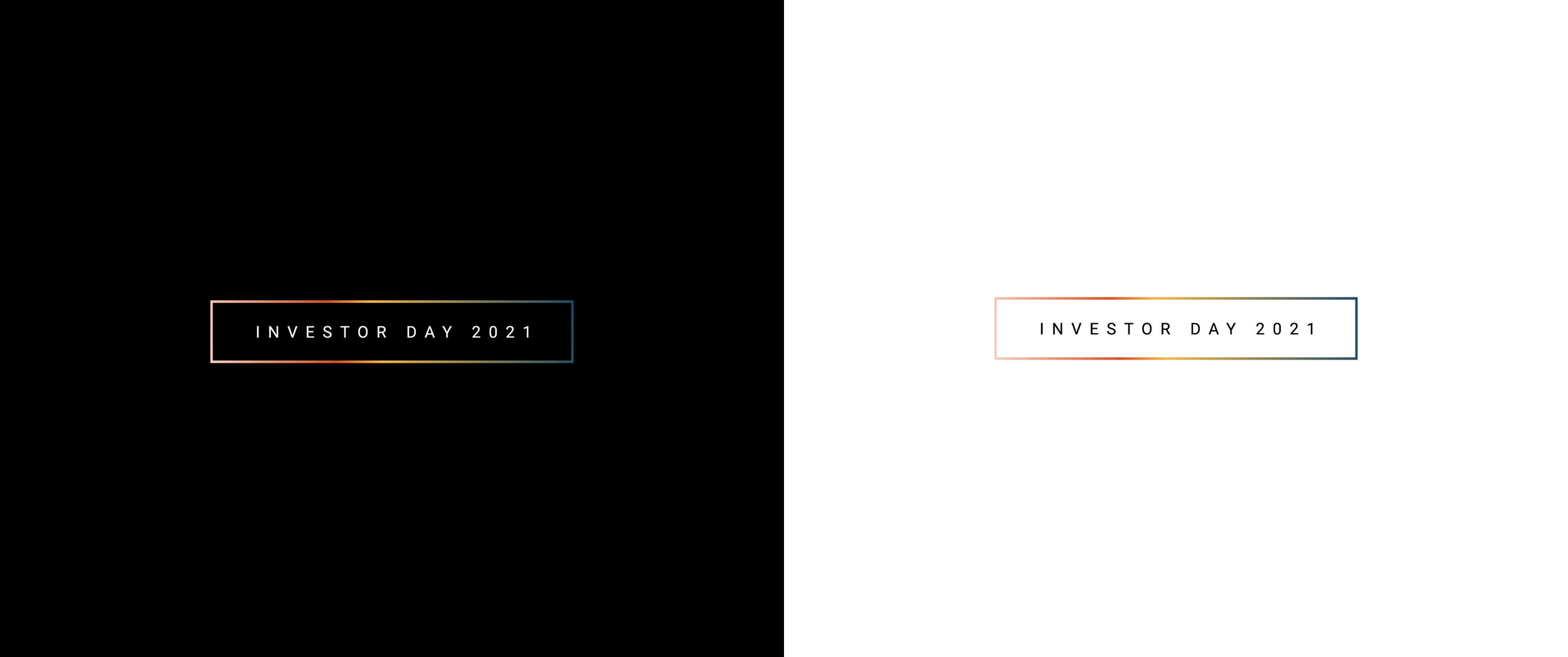
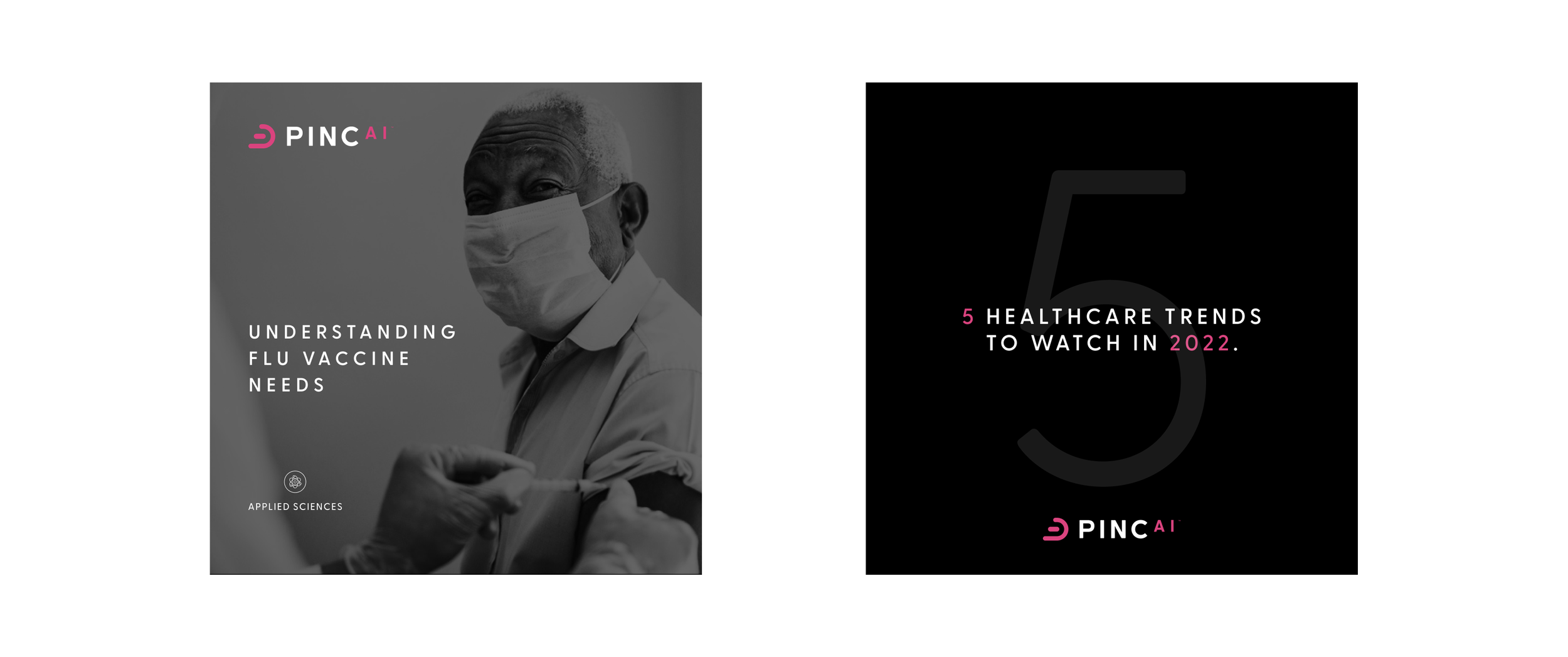
In August 2021, Premier brought its entire technology and services portfolio under a single brand: PINC AI. The identity existed. What didn't exist was the system for making it live anywhere outside a logo file. Months later, Investor Day put that brand in front of the analysts and institutional investors who decide what the company is worth, in a room where it had to hold for six hours across a stage, a set of screens, a broadcast feed, and every printed surface in the building.
The Truth
A rebrand is a claim, and Investor Day is where claims get tested. Premier was telling the market it had become a technology platform rather than a hospital purchasing organization. That argument couldn't just be made from the podium. If the room looked like the old company while leadership described the new one, the audience would believe the room. Design wasn't supporting the announcement. It was the evidence for it.
The Work
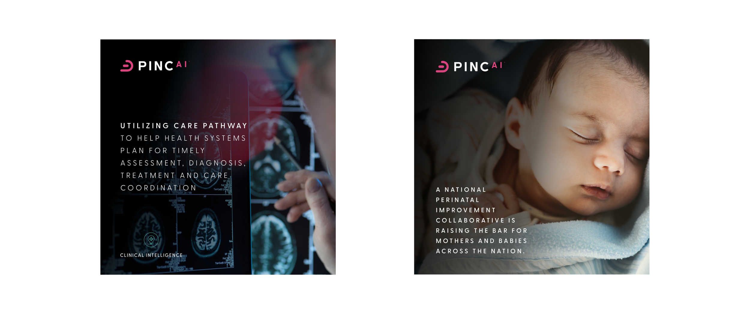
I developed and extended the PINC AI visual system into brand experience and environmental design, translating an identity built for digital and print into something that could hold a physical room at scale.
Environmental design. Stage graphics, digital media walls, LED pixel mapping, and video content built as one continuous language rather than four separate deliverables, designed to read from the back of the room and on camera.
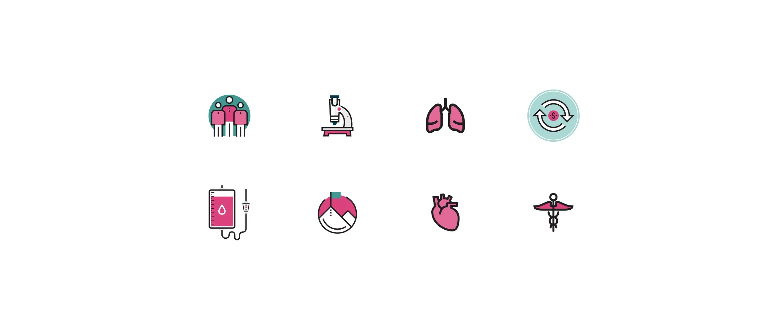
System extension. Iconography, motion, and application rules that carried PINC AI into contexts the original identity didn't account for, keeping it consistent while making it work at architectural scale.
Executive presentation design. Worked directly with C-suite leadership to turn financial performance and platform strategy into a visual narrative an analyst could absorb at speaking pace.
Technical execution. Coordinated pixel mapping, video, and print production across vendors and internal teams to hold the standard through delivery.
The organizing principle was legibility under scrutiny. Every choice had to survive an audience whose entire job is finding the gap between what a company says and what it is.
The Results
Investor Day 2021 was the first time PINC AI appeared at full scale in front of the investment community, months after the platform brand was announced publicly. The system I built carried it across every surface in the room and on the broadcast, so the repositioning wasn't something the audience heard once. It was the environment they sat inside all day.
Delivered during a period when Premier's stock rose 20%.