This isn’t where you’ll find Michelangelo chiseling the next David, folks. This is the sketchbook, the scribble on a napkin, the pilot episode that hasn’t quite nailed the characters but has you hooked anyway. The objective isn’t to dazzle you with execution but to tickle that part of your brain that whispers, “That’s something.”
New Balance:
Loyalty is for Dogs
Proof of concept
That one time I shot a 0:15 New Balance ad on my phone.
The idea is about brand loyalty and brand enthusiasts. The copy reads
“They say if you want loyalty, get a dog.
Good thing I have that “dog” in me.”
Then we cut to a man walking in and urban setting.
Boston (New Balance specific)
New York City
Los Angeles
Chicago
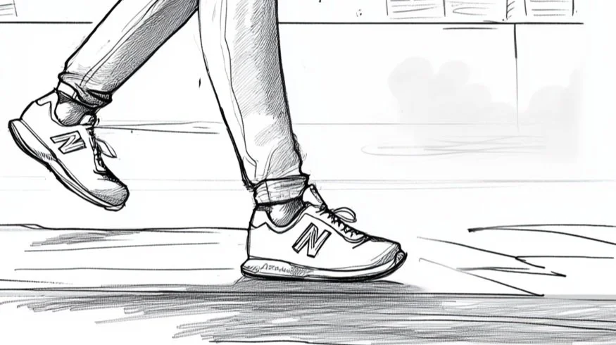

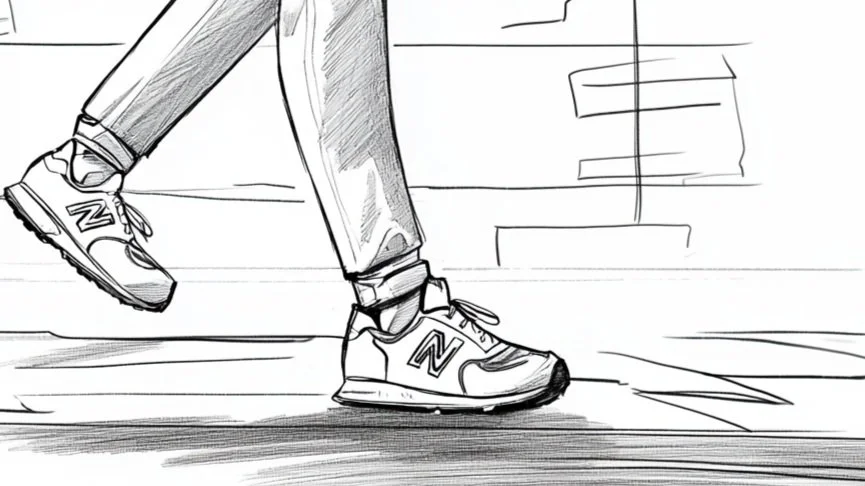
The shot is a ground-level, close-up showing of the side profile of the man’s foot. We see from about his ankle or calf down and every time he takes a step, the shoe changes to a different model and silhouette.
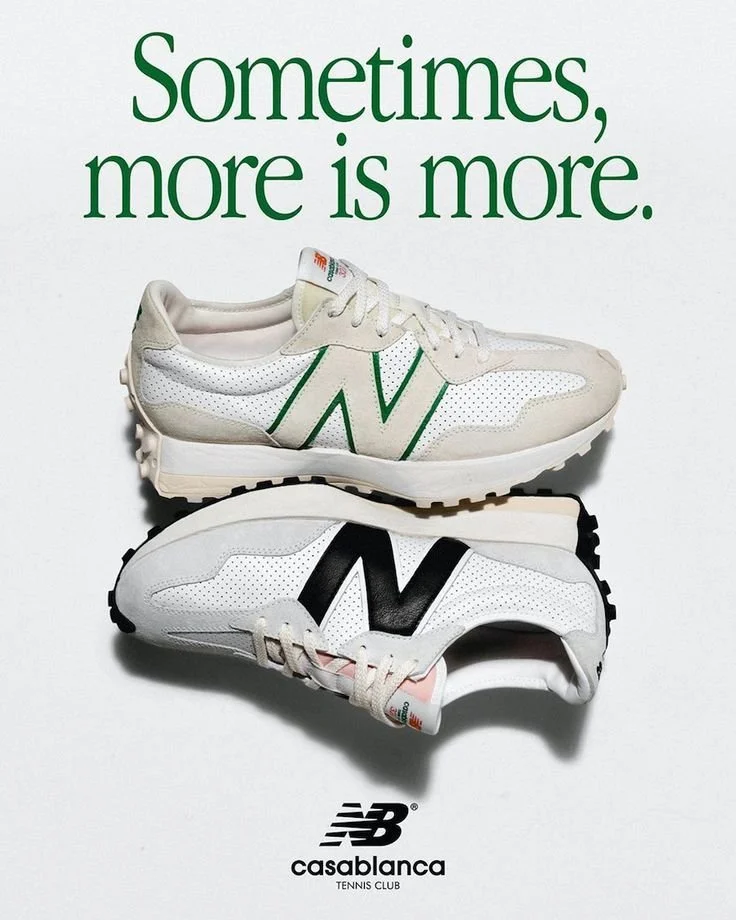
End the video with brand copy.
”Sometimes more is more.”
New Balance logo
end.
Credits:
Creative Direction and Concept: James Windham
Copywriting: James Windham
Video Production: James Windham
Music Supervision: James Windham
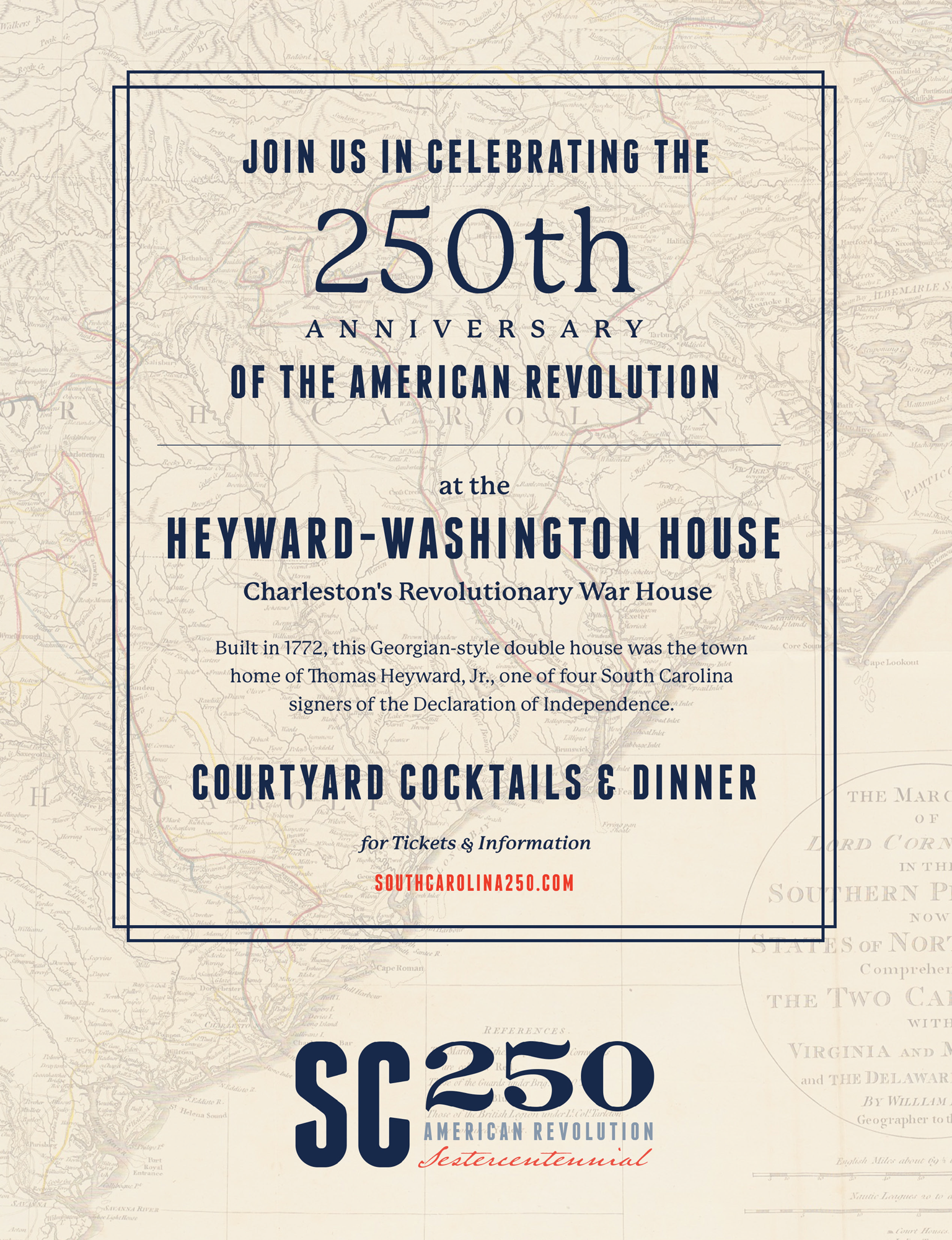
SC250
Sestercentennial of the American Revolution in South Carolina
Chartered by the SC General Assembly in 2018 … “which shall have the authority and responsibility to plan and execute, insofar as authorized and funded by the General Assembly, a proper observance of the Sestercentennial of the American Revolution in South Carolina, and in cooperation with the South Carolina Battleground Preservation Trust; a national organization, if any; and other similar commemorative organizations in other states. This proper observance of the Sestercentennial must include the role of persons of African-American descent in the Revolutionary War.”
With a mission to celebrate and promote South Carolina’s role in the American Revolution by educating, engaging, and inspiring South Carolinians and visitors.
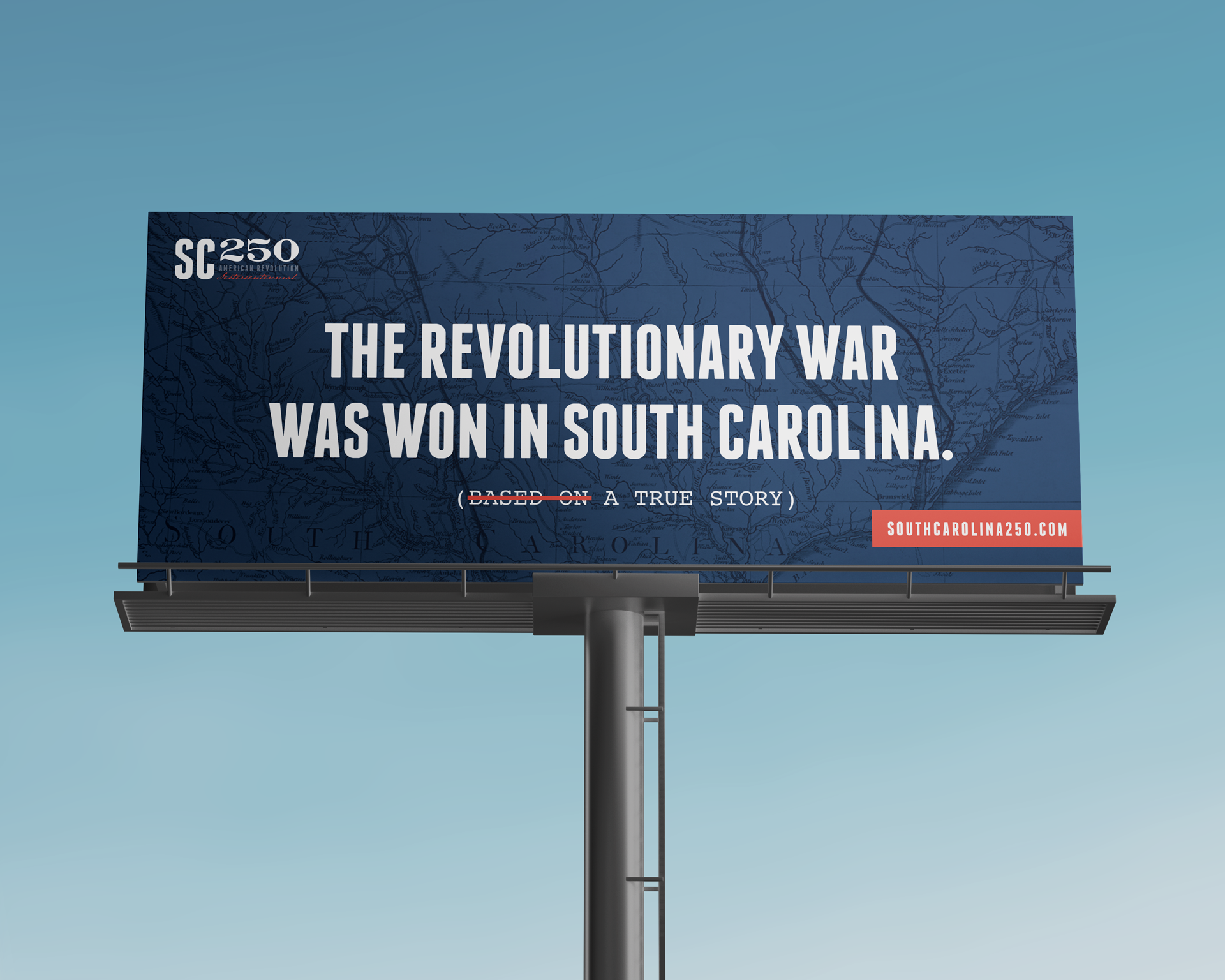
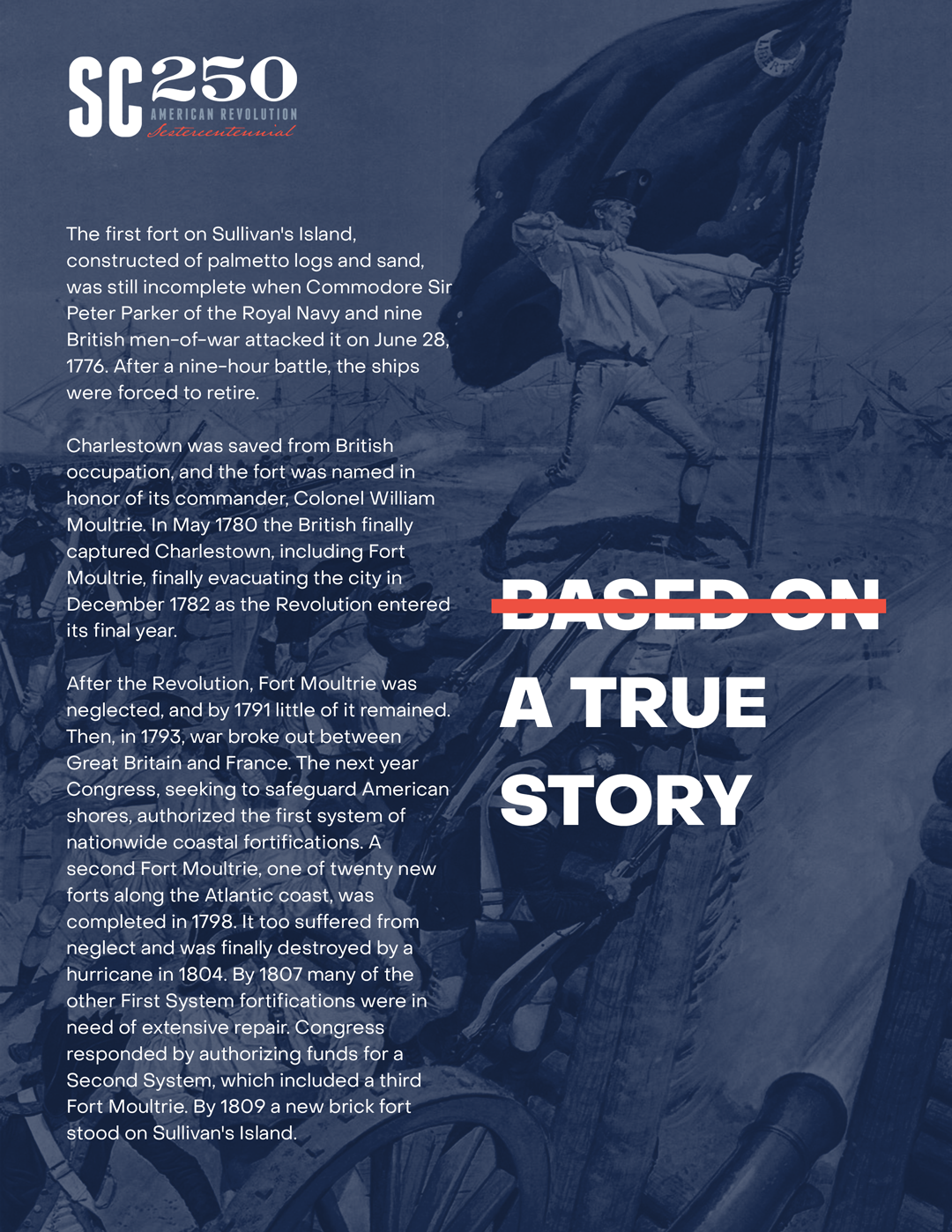
For South Carolina's commemoration of the 250th anniversary of the American Revolution, I developed a campaign concept that challenged audiences to reconsider what they thought they knew about Revolutionary War history.
The Concept: "The Revolutionary War Was Won in South Carolina" with a strategic visual twist—striking through "Based On" to leave simply "A True Story." This typographic device immediately signals that this isn't Hollywood fiction. This actually happened.
Design Approach: The struck-through text works on multiple levels: it grabs attention through unexpected typography, creates cognitive dissonance that makes people pause and think, and reinforces the authenticity of South Carolina's pivotal role in American independence. Bold, straightforward typography against historical imagery creates a modern approach to heritage storytelling.
The Result: A concept that transforms potential skepticism into curiosity, making 250-year-old history feel immediate and relevant to modern audiences. It's history that doesn't feel like a history lesson.